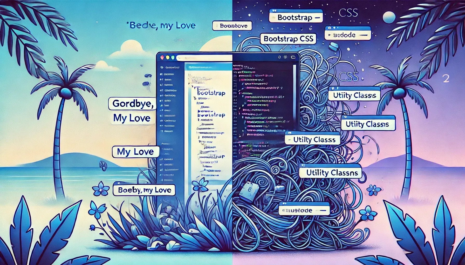
Migrating from Bootstrap to Tailwind
🗓️ • ⏱️ 17 min read
🗓️ • ⏱️ 17 min read
I’ve been writing CSS for a long time. I can’t pinpoint the exact date, but I started exploring web development around the turn of the century. I remember the days of table-based layouts and inline styles dominating the way sites were built. When Myspace came around in 2003, my still growing CSS skills ensured I always had the most custom looking profile page. I’m not saying this to brag, but to provide context for my long-lived history with CSS.
When I started working professionally as a web developer in 2006, most, if not all of the web was writing custom CSS, myself included. Now I could be totally wrong, but I can’t recall even the concept of a CSS library existing. JavaScript libraries were gaining traction - Prototype and MooTools were widely used and jQuery had just burst onto the scene. jQuery UI arrived in 2007 with some basic CSS styles, but it was nothing like what we have today.
Then, in 2011, Bootstrap (Twitter Bootstrap, back then) came along. Its opinionated design patterns and component based styling signaled a shift in CSS development. The first version was rather simple and still felt like an internal Twitter tool, which is how it got it’s start. It wasn’t until version two that responsive design was introduced. Since then, it’s become incredibly popular, with some stats still putting it’s usage at 18.5% of all websites. However, development has slowed in recent years. The last release, 5.3.3, was almost exactly a year ago on February 20, 2024. I know the team is working on version 6, but compared to how fast the rest of the web is moving, it feels like it’s lagging behind.
I’ve become super familiar and comfortable with Bootstrap over the years. I’ve used it for many personal projects and even in production as part of my job. When I rebuilt this site in 2021, I reached for my old friend, Bootstrap. However, as I continued making changes, I increasingly felt like I was hitting a wall. While I no longer write code professionally, I try my best to keep up with the latest trends and tech. Tailwind has been on my radar for a while, and with Bootstrap’s slow development cycles and the guiding principle of my website, I decided it was time to make a change.
Creating and maintaining this site also gives me an excuse to play around with new trends in web development.
As of a few days ago, this site has been completely rewritten with Tailwind. Aside from a few minor visual changes, nothing significant has changed in how the site looks and feels. This will be helpful in comparing stats below.
In this post, I will share some of my thoughts on building with Tailwind, my approach to the migration process, and data points from before and after the migration.
So, Bootstrap, I say this to you…

To my knowledge, there are no tools to automate this migration. I wanted to keep the overall look and feel of the site the same, so I went file by file, component by component updating classes and checking in the browser. I started with the header and footer, before moving on to the main content area. I targeted the largest breakpoint first, ensuring everything looked good on my largest monitor before adjusting for smaller screens.
The entire migration took place over a few weeks, working a few hours at a time. In total, I estimate spending about 30 hours on it.
The most time consuming, and honestly, frustrating part of the migration was typography styles (headings, lists, tables, etc.). I’ll share more about that in the Complaints section.
Most of my time was spent in the Tailwind docs and Chrome’s dev tools, but I also used the following resources to help with the migration.
Both Bootstrap and Tailwind have a spacing system. Bootstrap uses a scale from 1-5, while Tailwind uses a scale from 0 to any arbitary number.
Each system has a different base unit. Bootstrap’s is 1rem and Tailwind’s is 0.25rem. I created the following table to help convert between the two. This was super useful when going through files and needing to quickly convert a Bootstrap mb-5 (margin bottom of 48px) to Tailwind’s equivalent class, mb-12.
| Bootstrap | Tailwind | px | rem |
|---|---|---|---|
| 1 | 1 | 4 | 0.25 |
| 2 | 2 | 8 | 0.5 |
| 3 | 12 | 0.75 | |
| 3 | 4 | 16 | 1 |
| 5 | 20 | 1.25 | |
| 4 | 6 | 24 | 1.5 |
| 7 | 28 | 1.75 | |
| 8 | 32 | 2 | |
| 9 | 36 | 2.25 | |
| 10 | 40 | 2.5 | |
| 11 | 44 | 2.75 | |
| 5 | 12 | 48 | 3 |
Once I had spacing mapped out, I did the same for the various ways Bootstrap allows you to change font size, font weight, and line height.
I had to modify two Tailwind defaults to better match my existing font sizes.
@theme { --text-3xl: 2rem; /* 32px */ --text-7xl: 4rem; /* 64px */}I created and referenced this table for easily converting between Bootstrap and Tailwind classes.
| Bootstrap Class | rem | px | Tailwind Class |
|---|---|---|---|
| 12 | text-xs | ||
| 14 | text-sm | ||
h6 | 1 | 16 | text-base/5 font-medium mb-2 |
| 18 | text-lg | ||
h5 | 1.25 | 20 | text-xl/6 font-medium mb-2 |
h4 | 1.5 | 24 | text-2xl/7 font-medium mb-2 |
h3 | 1.75 | 28 | text-[28px]/8 font-medium mb-2 |
h2 | 2 | 32 | text-3xl/10 font-medium mb-2 |
| 36 | text-4xl | ||
h1 | 2.5 | 40 | text-[40px]/12 font-medium mb-2 |
fs-6 | 1 | 16 | text-base/6 |
fs-5 | 1.25 | 20 | text-xl/7.5 |
fs-4 | 1.5 | 24 | text-2xl/9 |
fs-3 | 1.75 | 28 | text-[28px]/10.5 |
fs-2 | 2 | 32 | text-3xl/12 |
fs-1 | 2.5 | 40 | text-[40px]/15 |
display-6 | 2.5 | 40 | text-[40px]/12 font-light |
display-5 | 3 | 48 | text-5xl/14 font-light |
display-4 | 3.5 | 56 | text-[56px]/17 font-light |
display-3 | 4 | 64 | text-7xl/19 font-light |
display-2 | 4.5 | 72 | text-[72px]/22 font-light |
display-1 | 5 | 80 | text-[80px]/24 font-light |
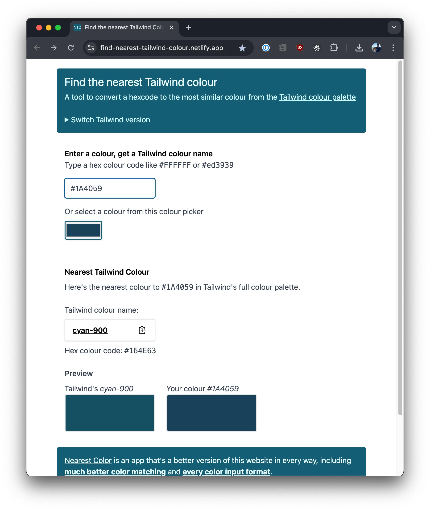
I wish I would have counted how many times I opened and used the Find the nearest Tailwind colour tool. It was bookmarked early on in my process and used a lot. It was so helpful that I ended up purchasing the Nearest Color app from the developer to show my appreciation.
I’ve been using the ColorSlurp Mac app for a few years now. It adds an icon to the top menu bar and allows you to easily pull up a color picker in any app with your keyboard shortcut of choice.
I use cmd + shift + M. Once you select a color it puts the hex value right into your clipboard. This combined with the nearest color tool made identifying and converting colors pretty seamless.

Call me old fashioned, but I’m still a bit stubborn when it comes to autocomplete in my code editor. I’ve been using VS Code for a few years now and I’ve gotten used to the way it works. Don’t get me wrong, when working with Typescript, having IntelliSense for seeing what props a component expects or a function’s signature is great. But when it comes to CSS and HTML, I find myself hitting esc to exit out of the suggestion way more than tab to accept it.
However, for learning Tailwind and getting used to the classes, the Tailwind CSS IntelliSense plugin was a huge help. I found myself using the autocomplete for all the classes more than I usually use IntelliSense.
I found the following tools in my initial research but didn’t use them at all.
Tailwind’s color pallette is really nice and should work for most non-designed interfaces. I was able to use a lot of it. However, my existing site used colors that I had grown to like and there weren’t any exact matches for them in the Tailwind pallette. With the help of tints.dev, I created two new color sets based on two shades of blue I needed #00ace6 and #0c5294.
@theme {    /* https://www.tints.dev/wave/00ACE6 */    --color-ocean-50: #dbf6ff;    --color-ocean-100: #b8edff;    --color-ocean-200: #9AC4D2;    --color-ocean-300: #3dcfff;    --color-ocean-400: #14c4ff;    --color-ocean-500: #00ace6;    --color-ocean-600: #13a0d1;    --color-ocean-700: #0d7092;    --color-ocean-800: #1f3749;    --color-ocean-900: #00222e;    --color-ocean-950: #000f14;
    /* https://www.tints.dev/wave/0C5295 */    --color-wave-50: #ebf5ff;    --color-wave-100: #d1e9ff;    --color-wave-200: #a8d5ff;    --color-wave-300: #7abfff;    --color-wave-400: #52abff;    --color-wave-500: #2495ff;    --color-wave-600: #0081fa;    --color-wave-700: #0069cc;    --color-wave-800: #0c5294;    --color-wave-900: #002a52;    --color-wave-950: #001529;}
Adding new colors this way allows me to use any of these values as utility classes the same way the native colors are available. So now I have access to things like text-ocean-500, decoration-wave-800, or bg-ocean-950.
Out of all the utility classes Tailwind provides, there is no support for word spacing. This was easy enough to add following the instructions for Functional utilities in the docs.
/* Positive word-spacing */@utility word-spacing-* {    word-spacing: calc(var(--spacing) * --value(integer));}
/* Negative word-spacing */@utility -word-spacing-* { word-spacing: calc(var(--spacing) * --value(integer) * -1);}Less suprising that it doesn’t exist compared to word-spacing is support for all the mask-* CSS properties.
I use masks images to act as dividers between the header/footer and main content area. I may write a full post on how exactly I did it in the future but since Tailwind didn’t provide the utility classes I needed, I created them myself.

Example mask divider image
@utility mask-wave {    mask-image :url('/src/assets/mask-divider-wave.png');    mask-repeat: no-repeat;}
@utility mask-wave-top {    mask-image:        url('/src/assets/mask-divider-wave.png'),        linear-gradient(#000 0 0);    mask-repeat: no-repeat;}
@utility mask-wave-full {    mask-image: url('/src/assets/mask-divider-wave-full.png');    mask-repeat: no-repeat;}
@utility mask-exclude {    mask-composite: exclude;}
@utility mask-bottom {    mask-position: bottom;}
@utility mask-bottom-* {    mask-position: calc(--value(integer)px * -1) bottom;}
@utility -mask-bottom-* {    mask-position: calc(--value(integer)px * -1) bottom;}
@utility mask-top { mask-position: top;}Let’s look at this example of how I previously applied the background color gradient to this site:
body { &:before { content: ''; width: 100%; height: 100vh; position: fixed; top: 0; background: var(--bs-body-bg); background-image: var(--jz-bg-gradient); }}Here’s the Tailwind equivalent:
<body class="text-sky-950 dark:text-zinc-200 before:w-full before:h-screen before:fixed before:bg-gradient-white dark:before:bg-gradient-blue">It’s not great and as you’ll see below, with typography, this isn’t even the worst of it.
Now there’s nothing stopping me from keeping the similar styles in a stylesheet. I could even use @apply to recreate the definition.
body { &:before { @apply w-full h-screen fixed bg-gradient-white dark:bg-gradient-blue; }}I suppose that’s a little better, but according to Tailwind, that would go against their wishes.
Whatever you do, don’t use
@applyjust to make things look “cleaner”. Yes, HTML templates littered with Tailwind classes are kind of ugly. Making changes in a project that has tons of custom CSS is worse.If you start using
@applyfor everything, you are basically just writing CSS again and throwing away all of the workflow and maintainability advantages Tailwind gives you, for example:
So I’ve bought in to the ways of Tailwind and done my best to write as little CSS in index.css as possible.
If there’s one part of Tailwind that absolutely feels like an afterthought in version 4, it’s their own Typography plugin. When Tailwind v4 launched, the typography plugin README had not been updated to match the new config settings. This comment on the main GitHub issue about sums it up.
I’m still a bit confused as to whether the whole @tailwindcss/typography plugin is considered legacy and deprecated or not. The readme doesn’t say anything about it being so, but the docs for @plugin state that directive is for loading legacy plugins. If it is legacy, how should users migrate away from it? benmccann
Even in v3, I struggled a lot with the typography plugin. I installed and uninstalled it a handful of times during the migration. As the posts and pages of this site are all Markdown files, I don’t have a super easy way of applying utility classes to all the elements generated in the render process. The Typography plugin was supposedly created to solve that.
The official Tailwind CSS Typography plugin provides a set of prose classes you can use to add beautiful typographic defaults to any vanilla HTML you don’t control, like HTML rendered from Markdown, or pulled from a CMS.
My two biggest issues with this plugin are:
Tailwind is as unopinionated as it comes. Different from something like Bootstrap that has a design language and builds components based on that language for your use, Tailwind is just a set of utility classes to allow you to compose whatever look and feel you want.
Tailwind Typography is opinionated. While providing out of the box styling for all the common typography elements is useful, there is no way to override those defaults.
For example, all links in the plugin get a font weight of 500 and an underline.
.prose :where(a):not(:where([class~="not-prose"],[class~="not-prose"] *)) { color: var(--tw-prose-links); text-decoration: underline; font-weight: 500;}If I want my links to be any other font weight I have to override their styles with a utility class. This feels wrong and against how Tailwind is meant to be used. Why not expose the text decoration and font weight values as custom properties the same way they did for the color?
To get the look and feel I want for the content on the site, this is what the class list for the wrapping div would have looked like.
---const classList: [    'prose',    'prose-headings:font-mono prose-headings:font-medium prose-headings:mt-12 prose-headings:mb-4',    'prose-h2:text-3xl prose-h2:text-wave-800 prose-h2:pb-2 prose-h2:border-b prose-h2:border-wave-950 dark:prose-h2:text-dune-400 dark:prose-h2:border-dune-800',    'prose-h3:text-2xl prose-h3:text-sky-800 dark:prose-h3:text-yellow-500',    'prose-h4:text-xl prose-h4:text-sky-950 dark:prose-h4:text-yellow-600',    'prose-h5:text-sky-950 dark:prose-h5:text-yellow-600',    'prose-a:no-underline prose-a:text-ocean-700 prose-a:hover:text-cyan-900 dark:prose-a:text-ocean-600 dark:prose-a:hover:text-sky-300',    'prose-p:mb-4',    'prose-th:font-sans prose-th:text-base prose-th:font-bold',];---
<div class:list={classList}>
This feels bad. Very bad.
So I ended up rolling my own styles in index.css which matches with an example in the docs for Custom CSS. My styles aren’t nearly as robust as the plugin’s but that means I have only exactly what I need while retaining full control.
@layer components {
    .prose {
        section:first-child > h2 {            @apply mt-0;        }
        a {
            @apply font-medium underline decoration-sky-600 underline-offset-(--offset);
            transition: --offset 250ms;            text-decoration-skip-ink: none;
            &:hover {                --offset: .35em;            }
} ... }}I started this migration while version 4 was still in beta which means I was referencing both the v3 and v4 docs at the same time. In the upgrade to v4, Tailwind also updated their docs site. In my opinion, it’s not nearly as organized and intuitive to use.
There also seems to be some important information missing. Unless you read the v4 update post, you’d have to stumble on Compatibiliy > Sass, Less, and Stylus > Nesting section to learn that Tailwind now uses Lightning CSS under the hood for transpiling, minification, and browser prefixing.
Certain things were deprecated but there’s no reference to that on the docs site. You’d have to go digging through the GitHub issues to find some of them.
Lastly, of my biggest gripes, and probably worth opening an issue about, is that when using command + k to navigate to a specific utility, the left hand navigation does not scroll to the property you navigated to.
Alright, enough whinning. Let’s look at some stats.
Tailwind aims to output the least amount of CSS as possible at build. Other than being super popular it was one of the bigger selling points for me to switch over. This small personal site of mine is relatively small so I wasn’t expecting huge decreases in CSS size but looking at the numbers below I was pleasantly surprised.
Bootstrap source is built in a modular way using Sass. With that, you are able to import only what you need into your project.
Given the relatively limited amount of features on this site, I was only importing 16 of the 32 available modules. Keep that in mind as we look at the final build files as had I been importing more or all it would have been much larger.
@import "./bootstrap.scss";@import "../../node_modules/bootstrap/scss/reboot";@import "../../node_modules/bootstrap/scss/type";@import "../../node_modules/bootstrap/scss/images";@import "../../node_modules/bootstrap/scss/containers";@import "../../node_modules/bootstrap/scss/grid";@import "../../node_modules/bootstrap/scss/helpers";@import "../../node_modules/bootstrap/scss/tables";// @import "../../node_modules/bootstrap/scss/forms";@import "../../node_modules/bootstrap/scss/buttons";@import "../../node_modules/bootstrap/scss/transitions";// @import "../../node_modules/bootstrap/scss/dropdown";// @import "../../node_modules/bootstrap/scss/button-group";@import "../../node_modules/bootstrap/scss/nav";@import "../../node_modules/bootstrap/scss/navbar";@import "../../node_modules/bootstrap/scss/card";// @import "../../node_modules/bootstrap/scss/accordion";// @import "../../node_modules/bootstrap/scss/breadcrumb";// @import "../../node_modules/bootstrap/scss/pagination";@import "../../node_modules/bootstrap/scss/badge";// @import "../../node_modules/bootstrap/scss/alert";// @import "../../node_modules/bootstrap/scss/progress";@import "../../node_modules/bootstrap/scss/list-group";// @import "../../node_modules/bootstrap/scss/close";// @import "../../node_modules/bootstrap/scss/toasts";// @import "../../node_modules/bootstrap/scss/modal";// @import "../../node_modules/bootstrap/scss/tooltip";// @import "../../node_modules/bootstrap/scss/popover";// @import "../../node_modules/bootstrap/scss/carousel";// @import "../../node_modules/bootstrap/scss/spinners";// @import "../../node_modules/bootstrap/scss/offcanvas";@import "../../node_modules/bootstrap/scss/utilities/api";In fact, if you were to load the entirity of Bootstrap from their primary CDN the total size is 233 KB.
Tailwind does not offer an all-included CSS file so the closest comparison is the JavaScript module you can use for development. That still comes in smaller than Bootstrap at 219 KB.
Now that the migration is complete, I can directly compare the CSS bundle size from my last Bootstrap deploy to the bundle size of the current deploy.
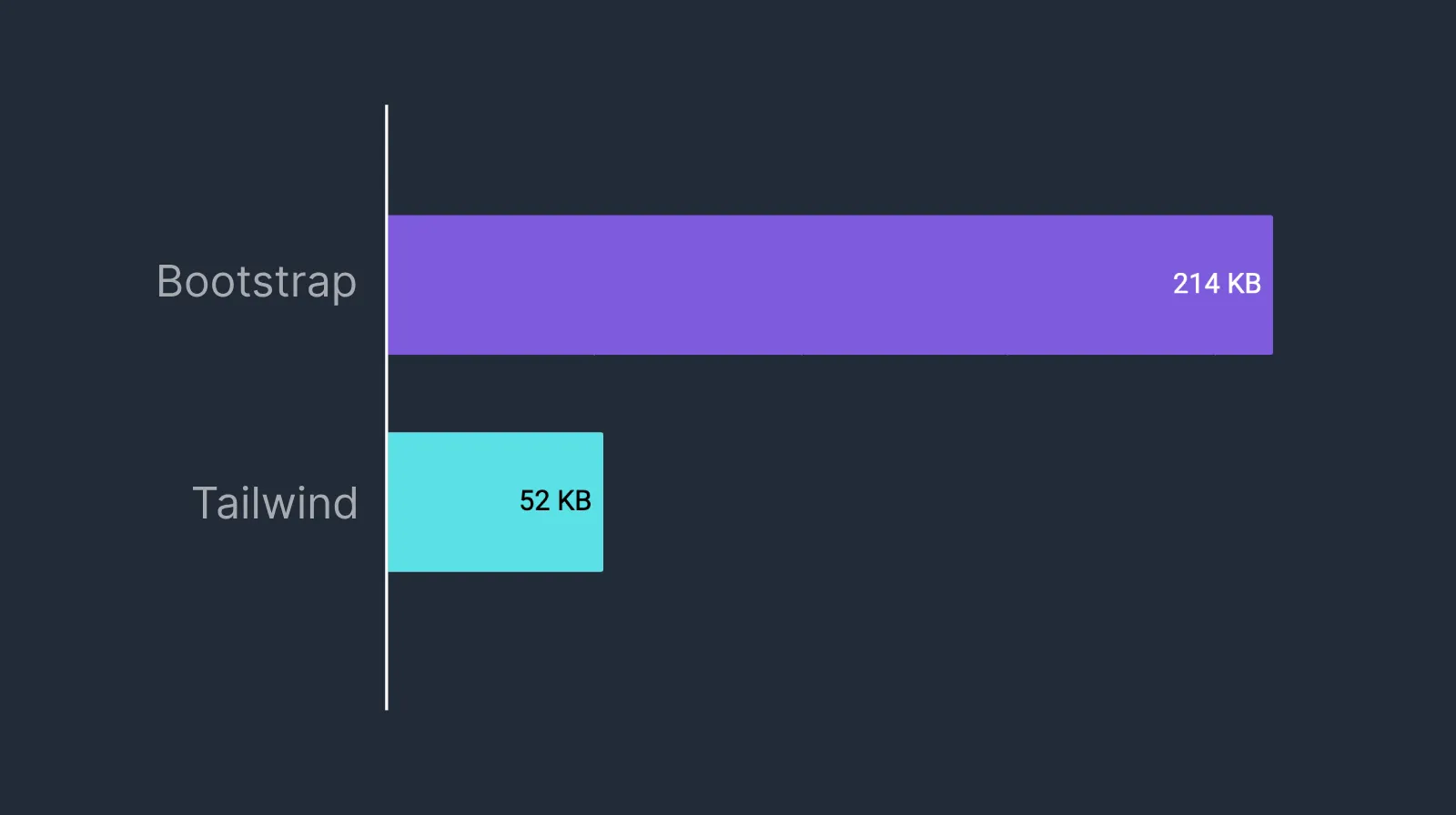
I know we’re only talking about kilobytes here but a reduction of 122% is quite the improvement. That 162 KB savings is minimal on per-user basis but over the ~5k page views my site sees a month, that’s a savings of 810 MB per month (not taking into account browser caching).
Also by removing Bootstrap, I was also able to pull out the purgecss, autoprefixer, cssnano, and sass-embed packages from this project.
You can view the entire pull request for the migration on my GitHub.
84 of 295
+5,326
-8,494
-3,168
Outside a few minor refactors and some TypeScript cleanup, these stats mostly represent the actual changes that went into this migration. I removed 14 .scss files that contained Bootstrap imports and custom styles I wrote for various parts of the site. In its place is a single index.css file that, at the time of writing, has 300 lines of code.
I use the excellent Astro Icon component to easily include any open source icons available at Iconify. Previous to this migration, I was using icons from Font Awesome, Material Design, SVG Logos, and Tabler.
I really like the look and feel of Tabler icons so as part of this migration I took the opportunity to drop all the other icon sets and use Tabler for everything.
Before with SVG Logos
After with Tabler

Before with Font Awesome sun icon

After with Tabler sun icon
I wasn’t very happy with the way links looked in their regular state so I ditched the text color and added a blue underline (decoration-sky-600) that animates down a few pixels on hover. Links feel more part of the content now and the blue I used works for both light and dark modes.
Link styles before
Link styles after
a {
    @apply font-medium underline decoration-sky-600 underline-offset-(--offset);
    transition: --offset 250ms;    text-decoration-skip-ink: none;
    &:hover {        --offset: .35em;    }
}
I used this fantastic guide from CSS { In Real Life } to help with animating the underline on hover.
As mentioned above, I don’t have a complete set of typography styles and I’d like to spend some more time creating a dedicated prose.css or typography.css for this site. It’ll be interesting to see what happens with the official plugin in the future.
This isn’t specific to Tailwind but I would like to explore using Container Queries for some of the components on this site. Tailwind 4 has solid support for them so it’s a good excuse for me to dive in, learn, and use them here.
Over the years I have gotten used to my own sorting order for style definitions in css files. That all went out the window with using Tailwind’s utility classes. I’d like to explore Tailwind’s recommended class order and install and use their Prettier plugin to put some order to the chaos that currently exists between the quotes of class attribute.
I like writing CSS. After 20+ years, my brain can read and process a stylesheet quite easily and even intuitively visualize the properties on the page. After a few weeks of Tailwind I’m starting to feel the same by looking at class attributes but reading utility classes still feels clunky compared to traditional CSS. The following quote still resonates a lot with me.
Using Tailwind is an exasperating experience for me, and I want the projects I work on to be fun. Tailwind is just not my cup of tea.
Josh W. Comeau
I’m still not completely sold on Tailwind for myself but this was fun. I found myself questioning whether or not I should see this migration through but I’m glad I did. The performance improvements alone were worth it to me. Plus I got to finally give Tailwind a whirl and have something new to write about.
I’m sure Bootstrap will continue to live on and a version 6 release is probably imminent now that I’ve completed this migration. For now, I’ll stick with it and see what comes next.
Found the above useful? Have a question? Thought of something I didn't?
Consider leaving a comment below or send me an email at johnzanussi@gmail.com.
You can also buy me a coffee. Cheers!

Comments